
Are you ready to learn what is mega menu because you want to improve your website’s navigation?
I’ll use this post to explain what it is, why and when you should use it, and show you a few examples of a mega menu.
Our team received many requests, so here we go.
If you’ve ever shopped online or read newspapers online, chances are you’ve come across a mega menu.

A mega menu can significantly improve the user’s experience on your website (when done right).
This post covers:
- Mega menu benefits, usage & examples in UX
- Why & when should you use a mega menu in web design
- 5 Best mega menus examples
- 5 Best mega menu alternatives
- Conclusion: Master using mega menus!
- FAQs about mega menus
Mega Menu Benefits, Usage & Examples In UX
A mega menu is a type of menu that expands with more than just links.
Typically, it displays choices in a two-dimensional layout with multiple columns or rows.
It lays out links vertically or horizontally.
ECommerce websites are the ideal candidates for mega menus, where you have a lot of categories to choose from.
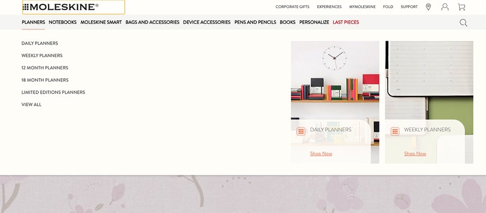
In some cases, they might even use images (and videos) to show products, like Moleskine’s website does in the example below, visually.
Mega Menu vs Drop-Down Menu
Mega menu and drop-down menu are two terms often used interchangeably.
However, they are very different.
A drop-down menu is a simple menu that’s organized in a single column and drops down when a visitor clicks or hovers over the link in the main navigation.
A drop-down menu is used when you have a few extra links that you want your visitors to be able to access without having to add them to the main menu.
The columns can also have sub-columns, which create a multi-level drop-down menu.
Why & When Should You Use a Mega Menu In Web Design
Now that you know what a mega menu is, let’s talk about why and when you should use it.
1. Why Use a Mega Menu?
Let’s take an average eCommerce website as an example.
If you have an online store and sell a lot of different products, you want your visitors to be aware of everything you have to offer.
You probably have a handful of main categories such as dresses, accessories, sportswear, underwear, swimwear, menswear, and similar.
Each category has more than one subcategory, such as long dresses, short dresses, cocktail dresses, evening dresses, etc.
The easiest way to show all those categories is to add them to your menu.
But, traditional menus occupy horizontal space in the header area of your site and are limited in space.
It will look cluttered and overwhelming if you add all those categories to your menu.
Which might cause your users to leave your site and never return.
And you don’t want that to happen!
That’s exactly where a mega menu comes in handy.
You can organize all categories and subcategories and present them only when a user interacts with the mega menu.
2. When to Use a Mega Menu
ECommerce websites are the best candidate for using mega menus because of the multiple categories and subcategories.
A few other use cases for mega menus include:
- A news-oriented website that covers a wide range of topics
- A corporate or any other type of website that has a lot of different departments or links
- When the mega menu enhances a website like in the case of Moleskine’s website above
Contrary to that, if your website doesn’t have a lot of links or even if you have an online store with only a handful of products, a mega menu wouldn’t improve the user’s experience.
It might even worsen as parts of the mega menu can cover other areas of your website the users are trying to access.
You also shouldn’t use a mega menu if you’re trying to send people to a specific page on your site.
For example, if you want to focus on booking consultation calls, then your menu and the rest of your website should make it as easy as possible to get to the necessary page.
5 Best Mega Menus Examples
Here are a few great examples of mega menus of some of the bigger websites.
1. PCSpecialist
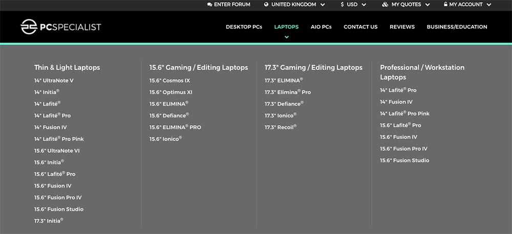
PCSpecialist specializes in selling computers and computer parts.
They have a mega menu for their laptop categories to organize the different options.
Quick. Access.
2. Home Depot
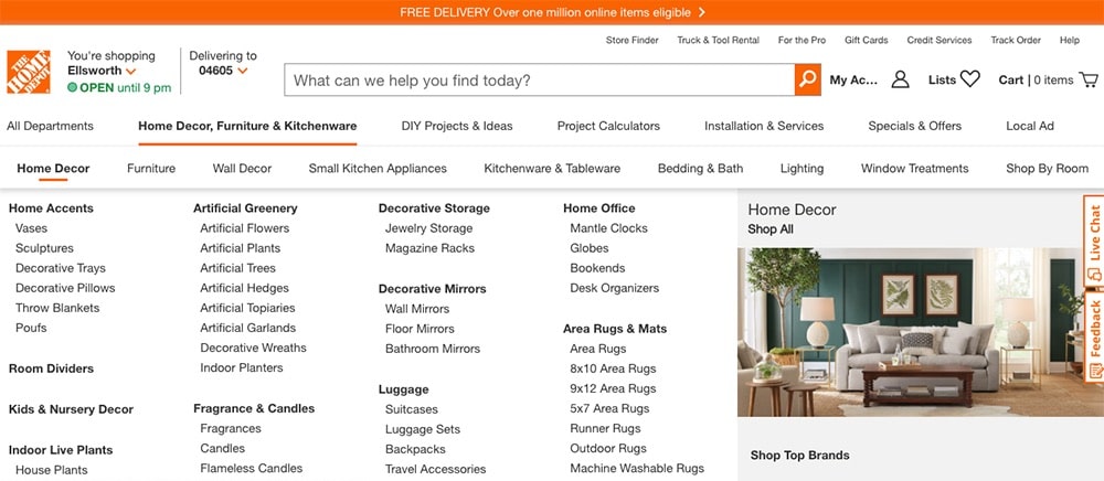
Home Depot has a lot of departments. Their mega menu makes it easy to find a desired category and browse their website.
3. Sony
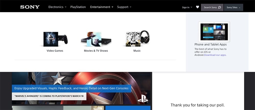
Sony’s mega menu incorporates images for certain links to make them more visually appealing.
4. Bed Bath & Beyond
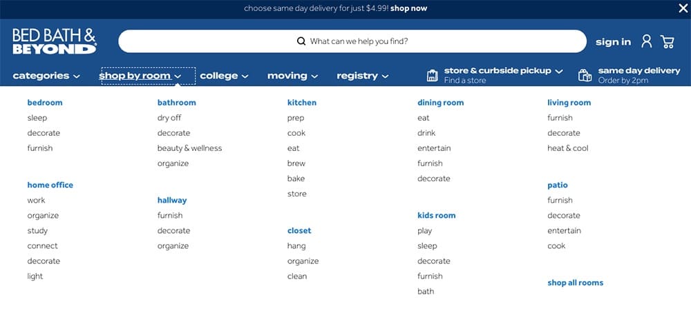
Similarly to other examples on this list, Bed, Bath & Beyond has a mega menu to organize all the different product categories.
5. Anthropologie
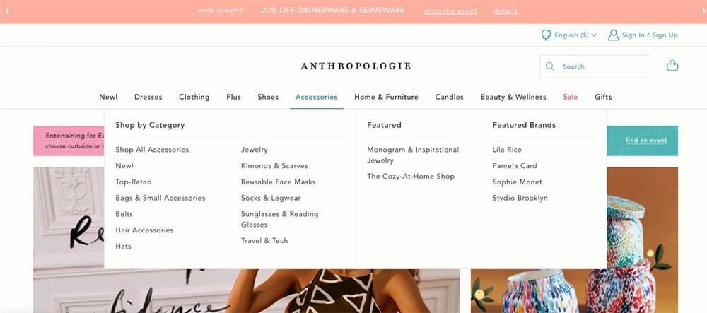
Anthropologie uses a very minimal and unobtrusive mega menu. It doesn’t take up the entire page however the links are still easy to access.
Note: Check our best collections of mega menu WordPress themes and mega menu Shopify themes.
5 Best Mega Menu Alternatives
Mega menus, while popular for providing quick access to a large number of options, can sometimes be overwhelming and may not always provide the best user experience.
Depending on the context and goals of your website, there are several alternatives you might consider:
- Simple dropdown menus: They offer a straightforward and clean navigation option (a user-friendly alternative to mega menus, if you will). They help prevent information overload by displaying fewer options at a time, making the site seem less overwhelming and more approachable, especially for new visitors.
- Vertical navigation: Vertical navigation is an excellent choice for websites with many items, providing a clear and organized way to display content categories. This format is also highly adaptable to different screen sizes, ensuring a consistent user experience across devices.
- Search functionality: Integrating robust search functionality provides users with a quick and efficient way to find specific content, making it a superior choice for user empowerment and satisfaction. This method particularly benefits websites with extensive content libraries, reducing navigation time and enhancing the overall user experience.
- Card-based UI: A card-based user interface presents content visually appealing and engagingly, providing a fresh and modern alternative to mega menus. This layout is especially effective for featuring specific sections or content, allowing users to quickly grasp the available options and make more informed navigation decisions.
- Accordion menus: Accordion menus are a space-saving solution that allows users to control which menu sections are visible, providing a neat and organized navigation experience. This menu style is handy for websites with extensive content categories, ensuring that the navigation remains clean and user-friendly without overwhelming the user with too many visible options at once.
Conclusion: Master Using Mega Menus!
In short, a well-designed mega menu can transform your site’s navigation from clunky to crystal-clear.
It gives visitors a fast overview of everything you offer without endless clicking.
When you organize links, categories, and even visuals or promos neatly under a single dropdown panel, you reduce friction and help users find exactly what they want.
Much. Faster.
For content-rich sites — eCommerce stores, news portals, corporate hubs, or service directories — an intelligently built mega menu isn’t just nice to have.
In fact, it can become the backbone of a smooth, user-friendly browsing experience.
That said, if your site is small or simple, don’t force it — a traditional dropdown or clean minimal menu might bring better clarity.
Use mega menus only when your content volume justifies it, and pay attention to clean layout, good grouping, and responsive design.
Done right, mega menus boost engagement, lower bounce rates, and make your whole site feel more intuitive.
And isn’t that what great web design is all about?
FAQs About Mega Menus
What is a mega menu?
A mega menu is an expandable menu that appears as a large dropdown panel when you hover or click on an item in the navigation bar. It typically shows multiple options and can include text, images, and links, organized into columns or sections for better accessibility.
Why use a mega menu on a website?
Mega menus are useful for websites with extensive content. They allow users to see all available options at once without navigating through multiple pages, improving the user experience by making site navigation more efficient and intuitive.
Are mega menus mobile-friendly?
While mega menus work well on desktops, they can be challenging on mobile devices due to limited screen space. Many websites convert their mega menus into accordion menus or other more mobile-friendly formats when accessed on smaller screens.
Can I add a mega menu to any website?
Yes, you can add a mega menu to almost any website. This can be done through coding or using plugins if the site is managed through a CMS like WordPress. There are various mega menu plugins available that make integration straightforward.
Do mega menus affect website performance?
Mega menus can affect website loading times, especially if they are heavy with images and scripts. To minimize the impact on performance, it’s important to optimize content and consider lazy loading for images within the menu.


