A hero section is one of the most critical elements of a website, as it sets the tone for the entire website and can be used to drive conversions.
In this article, we will explore a hero section’s anatomy, benefits, design principles, how to create one, best practices, examples of great hero sections, and when to use a hero section.
This post covers:
- What is a hero section?
- How to design a great hero section
- Hero section don’t’s
- FAQs about website hero section
What Is A Hero Section?
A hero section is a full-screen (or oversized) web page design that uses large images (a video or a slider), typography and call-to-action (CTA) buttons to grab the user’s attention and draw them to the website.
In plain English, it’s the first part of your website that’s visible before scrolling down. We also call this “above the fold,” but the hero section doesn’t necessarily cover the entire space.

You will often use it to promote a product or service, as it is a great way to capture users’ interest and draw them to the website. Because it’s the first thing they see.
The hero section usually features a large image or video, along with a headline, subheadline, and a CTA.
The goal of the hero section is to give the user a positive first impression of the website and to make them want to explore it further.
In our case, we don’t use a hero section; ULTIDA displays posts immediately. But each post has a featured image (which isn’t the same as a hero image).
What Are The Components Of A Hero Section?
A hero section is composed of several elements, which are essential to make it effective in terms of being actionable and leaving a solid impression on the visitor.
The first element is a large image or video.
This is the main focus of the hero section, and it should be high-quality and visually appealing.
The image or video should be relevant to the website and should provide an insight into what the website is all about.
I recommend you create your own and don’t use OVERUSED stock images and videos.
The second element is a headline.
This is the main message of the hero section and it should be clear and concise. It needs to be attention-grabbing, and it should reflect the message that the website is trying to convey.
The third element is a subheadline/text.
This is an optional element; you can use it to provide more information about the website and add more context to the headline. (Don’t overdo it; stick to one or two sentences max.)
The last element is a call-to-action (CTA).
This is a crucial element as it encourages the user to take action and explore the website further.
You can use a button or a clickable link, just ensure it’s visible and clickable. (It should tell visitors what they should do.)
Check these best call-to-action WordPress plugins if you’re using WP.
Why Use A Hero Image?
You should use a hero image on your website for several reasons.
Let’s explore these:
- It is an effective way to grab the user’s attention. The large image or video is the first thing that the user sees and it is a great way to make a positive first impression.
- You can use it to drive conversions. You can use the hero section to promote a product or service.
- It’s also a great way to provide insight into your website and set the tone for the rest of the page.
- And the last reason lies in its simplicity as it is very easy to create. You can create it with minimal effort, and it’s easily customizable to fit the website’s needs. But the outcome can contribute to improving your site’s user experience.
One of the ways of creating a striking hero section is with a free WordPress slider plugin.
How To Design A Great Hero Section
When you are creating a hero section, there are several design principles that you should follow.
Focus on the message.
The section should focus on carrying a message to the user, and it should be clear and concise.
Use Relevant Images Or Videos
You must always use high-quality images and videos that are relevant to your website. They should be visually appealing but not stock images that everyone uses.
Create your own!
Write A Short, Compelling Text (Title & Subheading)
The headline and subheadline need to stand out, and the CTA should be easy for the user to understand.
This way you will get the optimum number of conversions for your product or service.
Keep It Simple
Always keep it simple. After all, you want to attract your customers and not confuse or distract them.
And last but not least.
Be sure to use contrasting colors. The background and foreground colors should contradict each other, making the text easy to read.
Examples Of Great Hero Sections
To get a better idea of how a hero section should look, let’s take a look at a couple of examples:

Dropbox’s hero section uses a simple, uncluttered design with contrasting colors. The headline is short and attention-grabbing, and the CTA encourages visitors to take action.
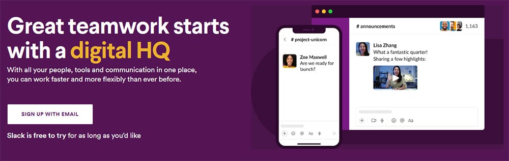
Slack’s hero section uses an interactive video to draw visitors in. The headline is clear and brief, and the CTA encourages visitors to sign up for a free trial.
Hero Section Don’t’s
Now that you know how to design a great-looking hero section with an amazing message for your visitors, let’s also take a look at what you shouldn’t do.
Too Many CTA Buttons
Never use more than two CTA buttons (and even that might be too much in some cases) as it can disperse attention.
The best hero images use one CTA button that draws your users’ attention. One great trick is instead of using two, use one but make it slightly larger.
Don’t exaggerate with too many visuals, as this can be overwhelming for visitors.
And please, avoid using clichés and generic phrases as they will repel many visitors.
Unoptimized Images
Images (or a video) are crucial to every hero section. There are two main mistakes administrators make when it comes to images:
- The image size is too big. You should never just upload the image that you downloaded from a stock website like Unsplash or directly from your camera. Always resize the image and don’t save it on maximum quality as you won’t really notice the difference. Give my tutorial about image optimizing a read if you would like to know more about the topic.
- Images are blurry or resized improperly. The size of an image needs to fit your WordPress theme perfectly. A blurry image looks very unprofessional and will lower your conversion rate.
Irrelevant Imagery/Videos
Don’t try to scam your visitors with images that are not relevant to your website or product.
While you may have some success with it in the short run, you will hurt your reputation in the long run.
It’s never worth it.
Also, avoid using generic, stock images. It’s always better to use images representing your business – the ones you create!
FAQs About Website Hero Section
What is a hero section on a website?
The hero section is the large banner or space at the top of a website, usually on the homepage. It typically includes engaging visuals, videos, text, and a call-to-action (CTA) button. This section is designed to grab visitors’ attention and convey the site’s purpose or highlight its main value proposition.
Why is the hero section important?
The hero section plays a vital role in setting the tone for the user’s experience. It helps to inform visitors about the brand or product quickly and encourages them to explore further.
How do you design an effective hero section?
An effective hero section should have a clear, concise message, compelling visuals that align with the brand, and a noticeable CTA that guides users on what to do next. Maintaining a balance between creativity and clarity is important to ensure the message isn’t lost amidst the design elements.
What should be included in the hero section?
The hero section should include a headline that captures the essence of the brand or product, a supportive subheading or brief description that elaborates on the headline, visually appealing imagery or video that complements the message, and a clear CTA button.
How do you make the hero section responsive?
Making the hero section responsive involves ensuring that it looks good and functions well on all devices and screen sizes. This includes using flexible images and typography that scales, optimizing text placement and button sizes for touch interactions, and possibly altering the layout or content for better mobile experiences.
::
Note: This article was originally published on April 30, 2023. But our team regularly reviews it and updates it with necessary improvements for accuracy.